Zendesk began as a start-up dream shared by three friends in Copenhagen. Their ambition was to build something better than the clunky and confusing customer service software already in the market.
Today, that ambition to make customer service less painful has evolved into a broader mission: to simplify the complexity of business and make it easy for companies and customers to create connections. Zendesk is now known as the leader in customer experience. Businesses, agents, and their customers are able to get what they need out of everyday interactions thanks to our software and expertise.
One thing that hasn’t changed over the years is that we’re always thinking about how to make things better for them. You can see this in the way we design our products, run our company, and in each and every detail of our fresh new brand expression. In fact, we approached our brand refresh with our customers’ love for our brand—and how it represents clarity and simplicity—in mind.
It’s always fun to explore new creative directions. But the Zendesk Creative Team—our own internal team of more than 40 creative professionals around the world, who conceptualized, developed, and executed our new brand identity—was specifically focused on how we could help the business. We wanted a look and feel that would position us as the undisputed leader and innovator in the customer experience space, in a way that would better resonate with current and future customers.
Our previous brand identity was charming and stylish, however as we transformed as a business and entered into a new chapter as a private company, it was no longer reflective of our new direction. We needed to rethink what makes us distinctive, and our creative expression plays a significant role in bringing our differentiation to life.
Overall, our brand expression needs to reflect our skills and experience. Zendesk is the only company that has been focused on customer service for over 15 years, and we wanted to express that in a way that’s confident, sophisticated, and well designed.
First, this led us to a makeover of our brand attributes – the foundational elements of our brand guidelines. We kept the focus on clarity and simplicity, but put away some of the brand elements from our younger years. We landed on new attributes, which are: Distilled, Confident, Generous, Freshhhh (the extra Hs are there for extra freshness).
At Zendesk, we value our customers’ feedback, which is why we’ve taken steps to refine our voice and tone. We’ve made it clearer and more confident, showcasing our skills and experience in a way that lets people know they can trust us and feel good about partnering with us.
This clarity is good for the brand, but it’s also an act of inclusion and respect. We want to be mindful of people’s time, and meet our customers where they are. Just like in any good customer service interaction, we aim to provide clear and concise communication that shows we value our customers and their needs.
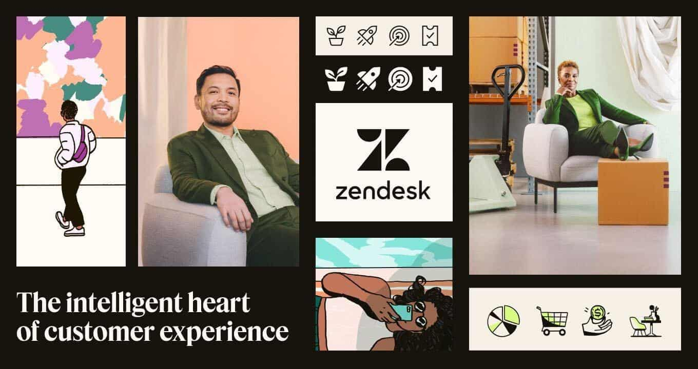
In rolling out the new brand identity, we said goodbye to kale, one of our core brand colors, the ‘relationshapes,’ and metaphorical imagery we’d used in the past. The new look focuses on the future and the company we represent, with a few key elements that honor our history. Our new primary colors are espresso and cream, and secondary colors are berry and matcha (the latter of which is inspired by our original Zendesk chartreuse).
Imagery is where we bring the feelings of customer experience to life. Our illustrations and photography are designed with the feeling we want our customers to have when they use Zendesk: comfort, joy, and the confidence of knowing they have the right technology for the job.
Designing imagery for a tech company is never easy. Software is not a natural movie star, as we like to say. To help the audience along, we use illustration and photography as storytelling devices. Following the same insights that guided our voice and tone, we created new imagery that is more literal and descriptive. It is designed to help our customers get to the information they need, and hopefully open a window into how it feels to use our software.
Our new brand expression will start rolling out in the coming months on social media, brand campaigns, our website… and maybe even a tote bag or two. The first big reveal will happen at our global user conference, Zendesk Relate, which is taking place next week, May 10-11. The event will be draped in the new Zendesk look and feel, from videos and keynotes, to badges and swag. Even the space itself will be decorated from floor to ceiling in our new Zendesk brand identity, including our sparkling new tagline: The intelligent heart of customer experience
The little company that began as a dream has grown into a CX leader. I’m confident our new look and feel is reflective of our position in the industry, and the future we are creating for ourselves and our customers.
