Article • 2 min read
Zendesk customization - best practices for UX, part 3
อัปเดตล่าสุด September 21, 2021
Wow, this post brings back memories. The articles linked to in this post are no longer relevant (sad, we know)> For more up to date Help Center inspiration, visit our Pinterest page.
Visit this article about branding if you want more to learn more about giving your Help Center the look and feel of your brand.
Also, this article will show you how to customize your Help Center theme.
In Part 1 and Part 2 of this series, we discussed concept and design best practices for your Zendesk, including ways to encourage self-service through the placement of your search bar and organizing support content by popular and relevant topic categories.
In part 3, we’ll take an in-depth look at how certain Zendesk customization is actually done on the back end. That’s right, we’re getting into the nitty-gritty of HTML, CSS, and JavaScript! But fear not. For those of you wishing to customize your Zendesk beyond our out-of-the-box customization options, but want something less advanced than the steps offered below, please visit our support forums where you can find helpful documentation, including our CSS Cookbook.
For others, creating the seamless brand experience you want requires a substantial amount of advanced customization technique. Take a look at how these Zendesk customersWooga, Moonfruit, and Podiodesigned their Zendesk.
Visit the Wooga support portal.
Visit the Moonfruit support portal.
Visit the Podio Help Centre portal.
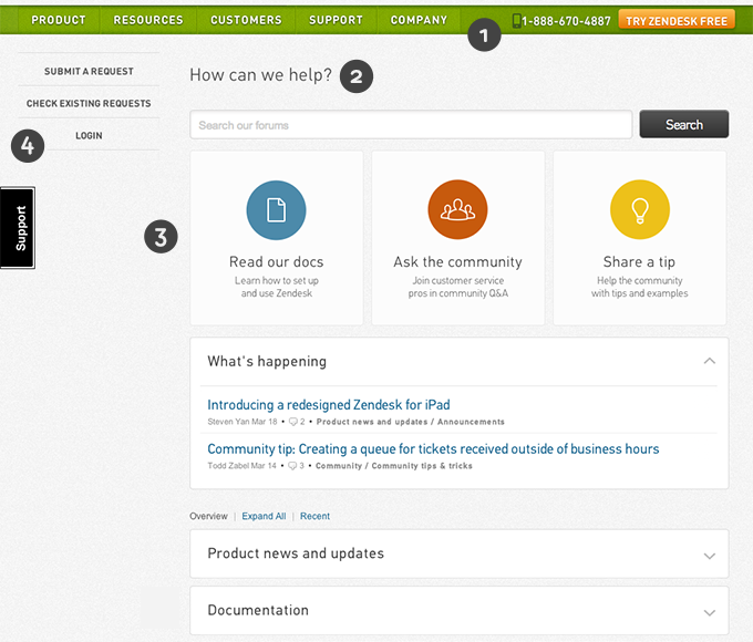
Just like the branding customizations of our customers shown here, Zendesk rebranded its web portal to have the same look and feel as another page within zendesk.com. If you’d like to learn more about what we did, read on!
To make our support web portal look like another page within zendesk.com, we skinned it with the design and navigation of zendesk.com. To do this, we inserted new HTML and CSS code into our site using JavaScript.
Here are four customization techniques we apply:
1) We replace the header and footer with the header and footer from zendesk.com
2) We customize some of the text on the page, i.e. “How can we help?”
3) We add three big action buttons to direct users to specific categories within our forums
4) We create left sidebar navigation to replace the links from the top menu bar, i.e. “Submit a request.”

Here’s how to do it. First, you must create a Zendesk widget that references the JavaScript code that inserts these customizations into your web portal.
Custom skinning your web portal
After you’ve created the widget, the following articles describe the next steps in detail:
Inserting your own custom header and footer in your web portal
Replacing text elements in your web portal
Adding custom call-to-action buttons on your web portal home page
Adding your own custom sidebar navigation to your web portal
Whether it’s branding, features, or functionality, Zendesk is designed to help you provide the best customer service possible. Visit our forums to learn how to make your Zendesk perfect for you and your customers.
